




Sumblime Software | Logo design
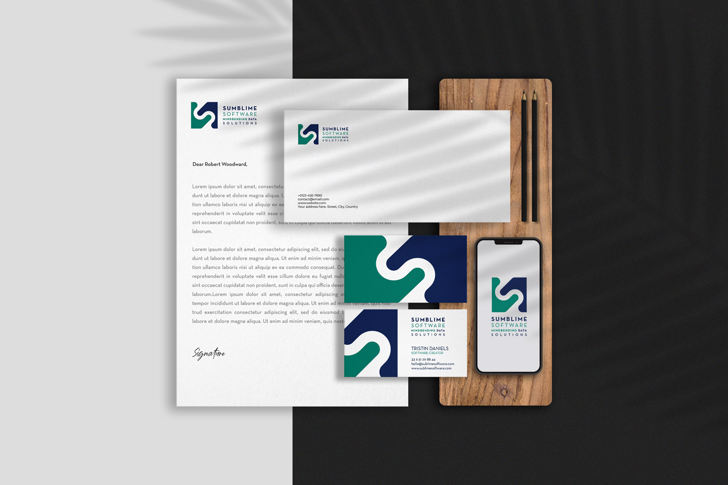
Sumblime Software is a fictional software company created as part of a logo design case study. The project explored how a simple geometric mark could communicate connection, flow, and the movement of data through a clean, modern visual identity.
The symbol was designed to feel both technical and approachable, using interlocking forms to represent collaboration, continuity, and innovation. Paired with a restrained colour palette and minimalist typography, the identity translates seamlessly across digital applications, stationery, and brand materials.
The result is a scalable, professional logo system that demonstrates how thoughtful simplicity can create a distinctive and memorable technology brand.
Design a logo and visual identity for a fictional software company, including brand direction, typography, colour palette, and supporting stationery applications.